first mode
Maximum autonomy
Parent experience
Limited information | the child drives their own journey independently, with minimal parental visibility.
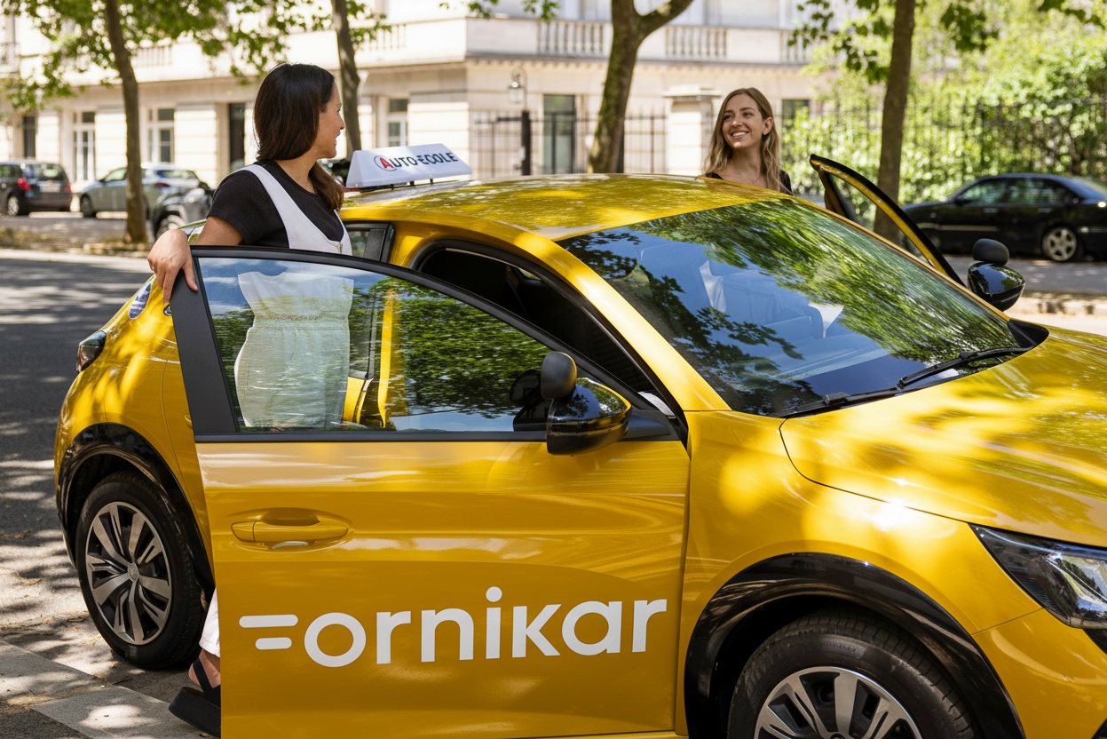
01 | Opening hook
case study


Every parent we spoke to said roughly the same thing:

I trust my child. I trust the instructor. I just have no idea what's actually happening."
Every parent we spoke to said roughly the same thing: "I trust my child. I trust the instructor. I just have no idea what's actually happening."
That gap | between trusting and knowing | is where ornikar lives. This case study follows how our team designed the parent companion app for Ornikar, France's leading online driving school. Our brief was simple on paper: help parents support their teenager through the licence process. What we discovered was more nuanced. Parents didn't want to surveil. They wanted just enough visibility to stay calm.
Building that balance | without tipping into surveillance | shaped every decision in this project.
Team Thibault Pousset, Ha My Vu, Verena Grotenrath

Scope
Discovery

Delivery
RoleUX designUI designResearch
All team members participated in the entire process:from ideation through user research, design, and testing, to iteration.
Why this problem is harder than it looks


02 | Context & opportunity
The core tension we had to solve
Ornikar had already built a strong product for learners. What existed for parents was almost nothing: no visibility on hours completed, no progress updates, no way to contact the instructor without feeling intrusive. Parents were financing the licence | sometimes the entire thing | and operating in complete darkness.
The opportunity wasn't just to build a notification system. It was to reframe the parent's role entirely: from anxious bystander to calm, informed supporter. That reframe became our north star.
Ornikar had already built a strong product for learners. What existed for parents was almost nothing: no visibility on hours completed, no progress updates, no way to contact the instructor without feeling intrusive. Parents were financing the licence | sometimes the entire thing | and operating in complete darkness.
What we were really trying to understand
Before touching Figma, our team of three spent a week in qualitative research. We structured our interviews around three questions that we thought would tell us everything | and one of them turned out to be wrong.
We went in expecting to find frustrated parents who wanted more control. What we found were parents who had actively chosen to step back | but were unsettled by the silence that followed. Our original assumption that "more information = better" needed rethinking almost immediately.
We interviewed five parents across a range of situations: children who hadn't yet started, children mid-way through, and children nearly ready to sit their exam. We specifically sought variety in involvement style | from hands-off to closely engaged | to avoid designing for a single persona.
Solange
Daughter learning code, very hands-off, age gap means low urgency
Morgane
Child hasn't started yet, strong autonomy values, anxious about choice paralysis
Ségolène
Two children in process, pays for it, wants key info only | not an extra app
Kaelig
Older children who enrolled without telling parents | near-total autonomy
Philippe
Reluctant about the licence, strong education philosophy of self-reliance
We moderated across the team | Thibault, Ha My, and Verena | to prevent a single interviewer's framing from biasing the synthesis.
This mattered: the same question landed differently depending on who asked it.
Primary Parent Concerns
Progress Visibility: 20%
Cost Management: 5%
Communication Gaps: 15%
Instructor Quality: 25%
Safety & Security: 35%

Parental Involvement Levels
Financial Support
Progress Monitoring

Administrative Help
Instructor Communication
Emotional Support
Practice Supervision
Information Needs vs Current Satisfaction
Detailed Process Info
Gap 55%
Priority
95%
Current Satisfaction
40%
Regular Progress Updates
Gap 45%
Priority
90%
Current Satisfaction
45%
Instructor Feedback
Gap 50%
Priority
85%
Current Satisfaction
35%
Instructor Feedback
Gap 50%
Priority
85%
Current Satisfaction
35%
Statistics & Comparisons
Gap 50%
Priority
70%
Current Satisfaction
20%
Milestone Notifications
Gap 30%
Priority
80%
Current Satisfaction
50%
What actually surprised us
No tool, no update, no moment of shared progress. Our job was to create those moments without making the child feel watched.
Parents were universally "in the fog"
Parents were universally "in the fog"
Every interviewee | regardless of how involved they wanted to be | had no idea how many hours their child had completed, what skills were mastered, or when the exam might realistically happen.
Autonomy wasn't avoidance | it was a value
Parents who were hands-off had made a deliberate choice. They trusted their children and the professionals. They didn't want to be pulled in | they wanted reassurance that not intervening was the right call.
Dialogue almost always started with the parent
Across nearly all interviews, it was the parent initiating check-ins, not the child. Yet parents felt awkward about this | like they were intruding on something that belonged to the teenager.
Crises created the most unmet need
Ségolène's daughter had a difficult episode with an instructor. The school handled it, but Ségolène only found out through her daughter | not through Ornikar. That gap between incident and awareness was the sharpest pain point we heard.
Kaelig, parent of two Ornikar learners
Unless you drive with them, you wouldn't know. Titouan - I have no idea.
That quote | "when you're not in the car, you know nothing" | became a design mantra for us. The parent's experience was structurally invisible.
05 | Ideation
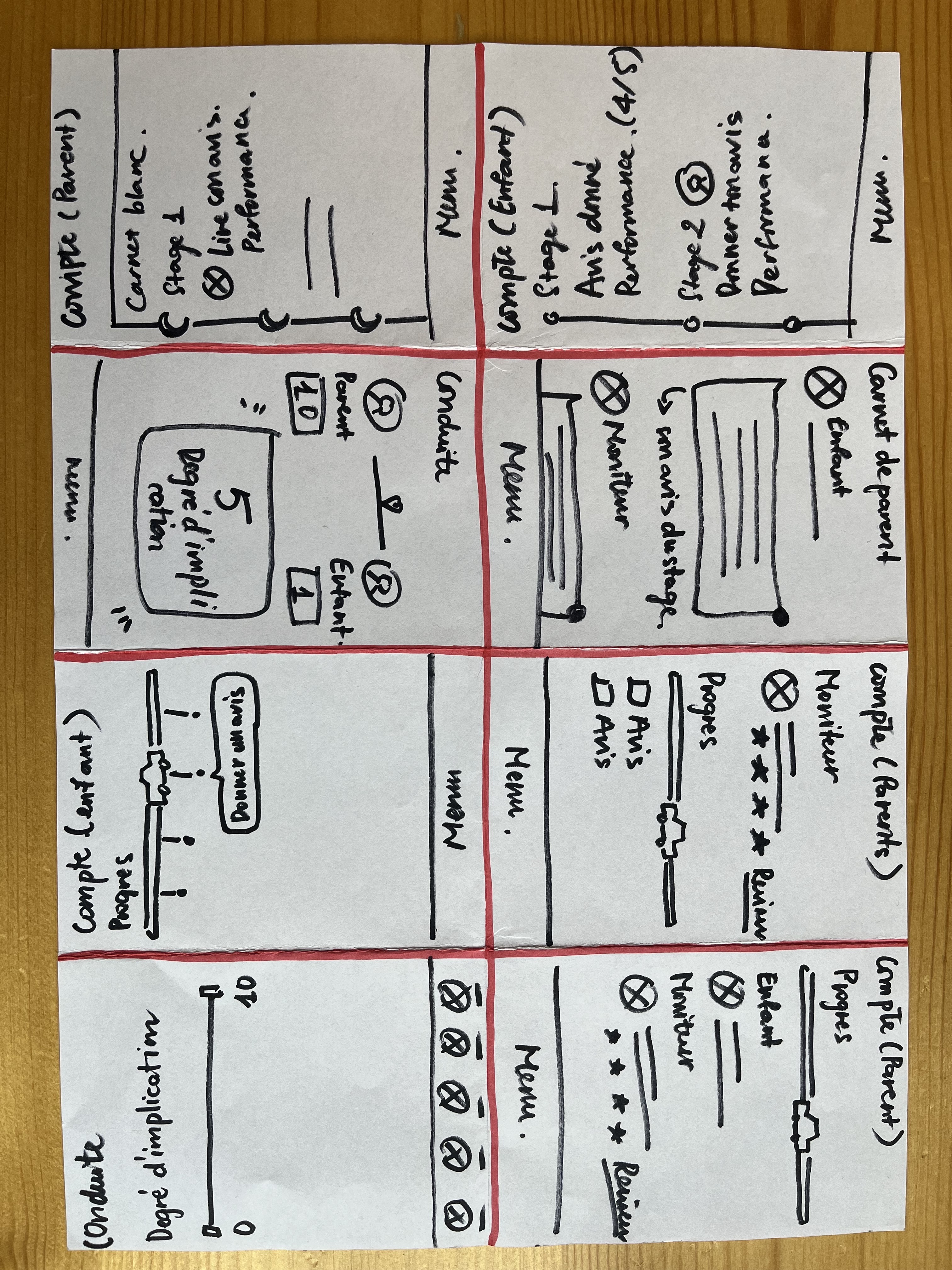
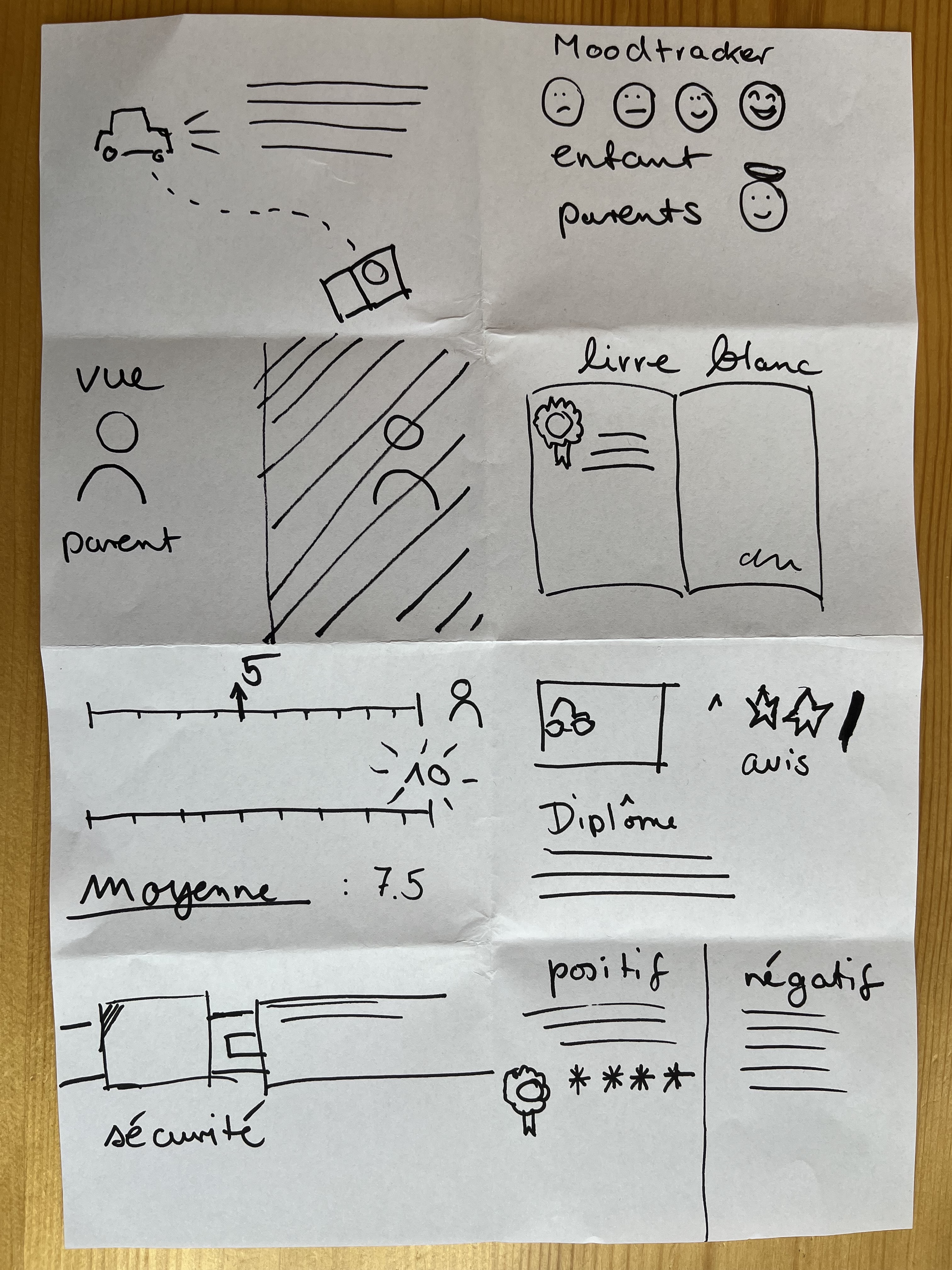
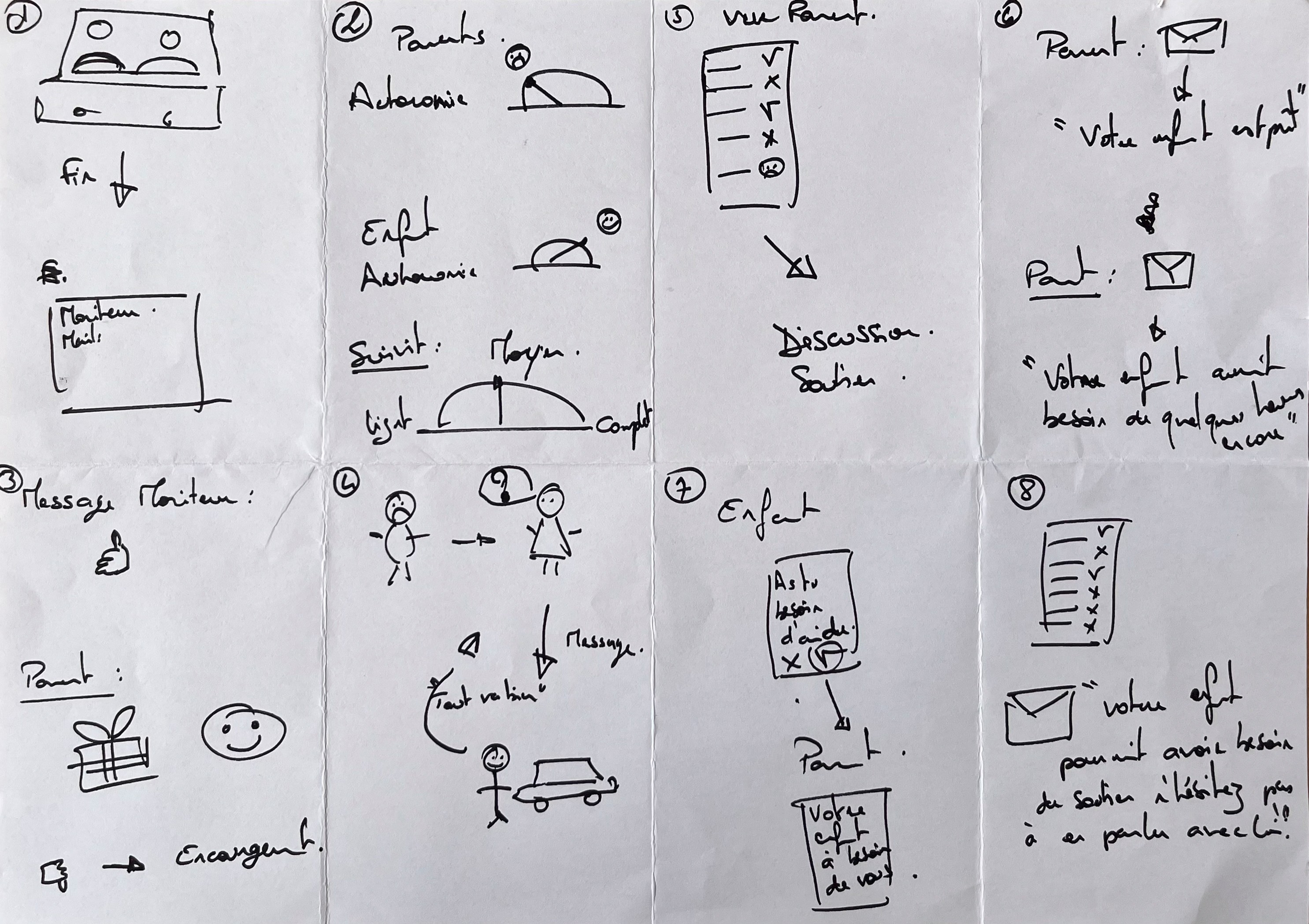



Our first bet | and why we had to change it
Our V1 had three parent profiles: Soutien Actif (all notifications on), Soutien Discret (limited alerts), and Autonomie Maximale (fully hands-off). It felt elegant in theory | we were honouring different parenting philosophies.
Testing it revealed a problem we hadn't anticipated.












Parent experience
Limited information | the child drives their own journey independently, with minimal parental visibility.
Parent experience
More visibility on learning | parents can follow progress without interfering with their child's autonomy.


L
M
M
J
V
S
D
30
31
1
2
3

4
5

6
7
8
9
10
11

12
13
14
15
16
17
18
19
20
21
22
23
24
25
26
27
28
29
30
31
1
2
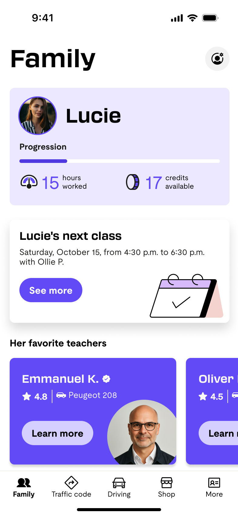
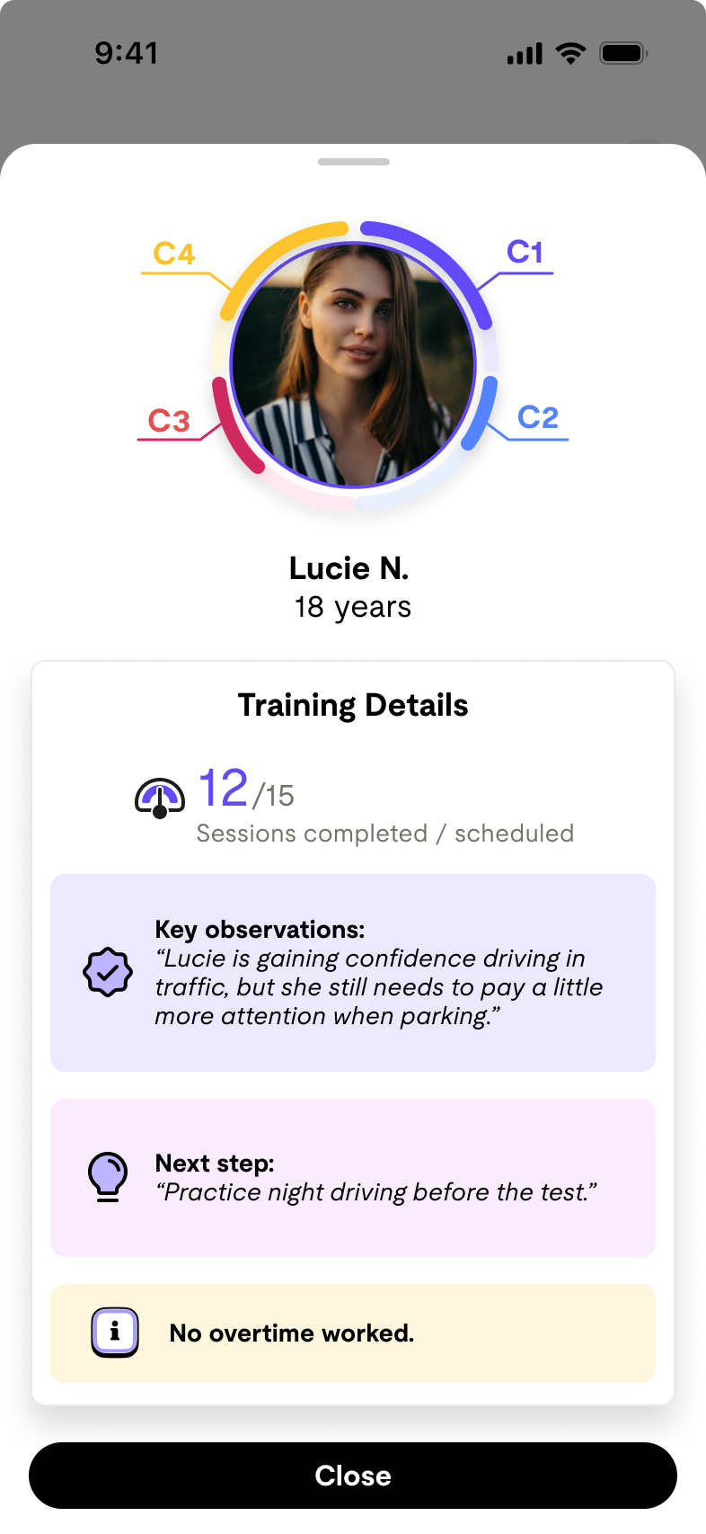

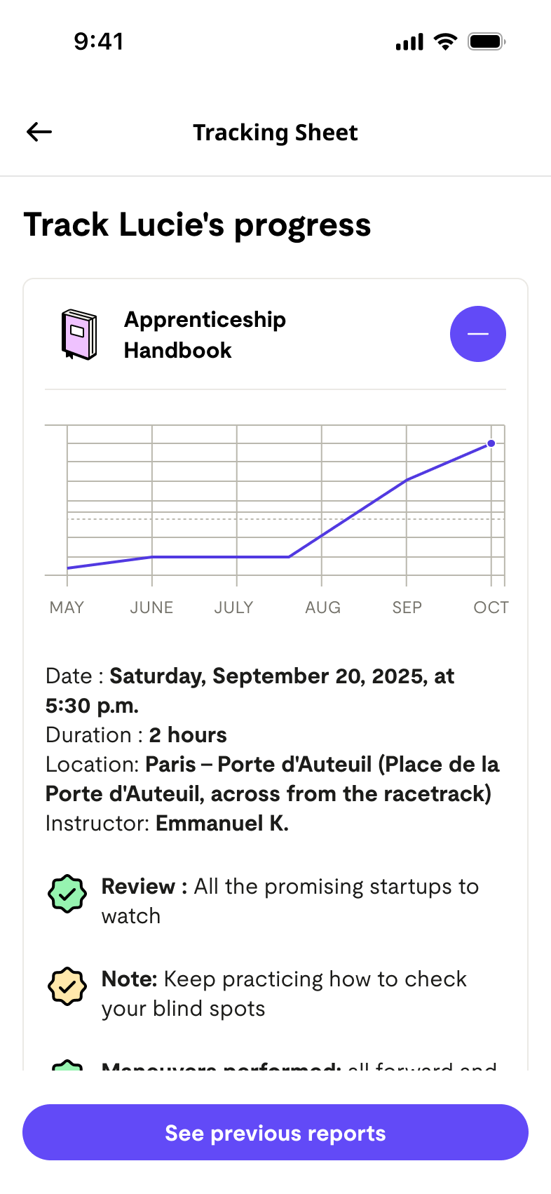
Parent experience
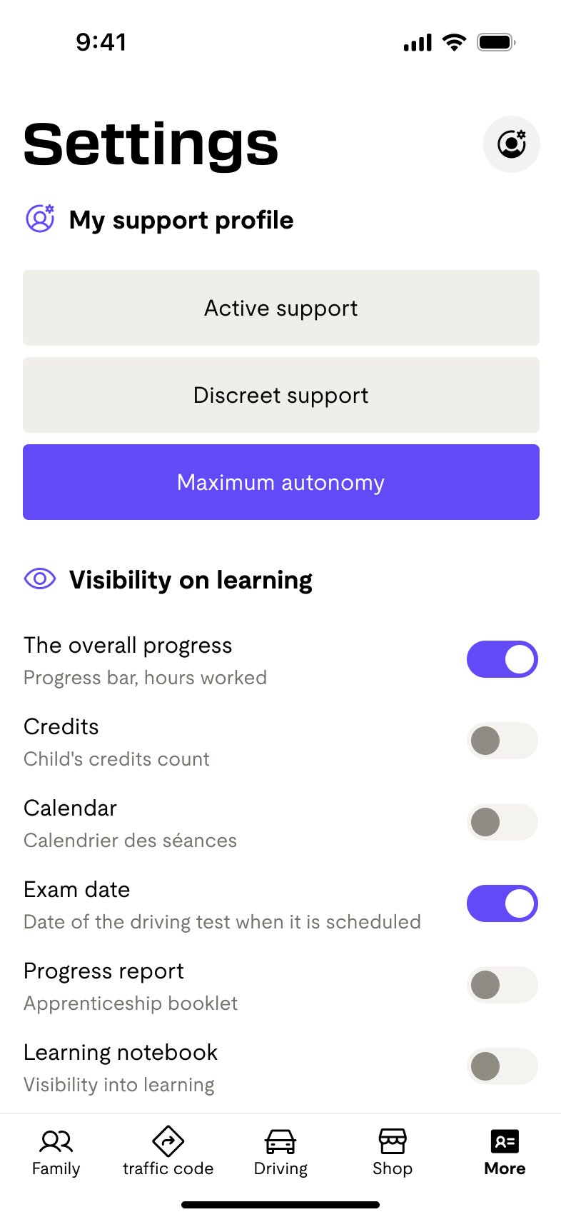
Total visibility on progress | full access to upcoming lessons, hours completed, credits, and favourite instructors.
One size doesn't fit all. Beyond the three pre-defined modes, parents can individually toggle which information they want to see | from progress bars and exam dates to instructor profiles and the learning log.

What testing showed
What we assumed
Parents who were hands-off had made a deliberate choice. They trusted their children and the professionals. They didn't want to be pulled in | they wanted reassurance that not intervening was the right call.
What testing showed
Across nearly all interviews, it was the parent initiating check-ins, not the child. Yet parents felt awkward about this | like they were intruding on something that belonged to the teenager.
1
Learning journal
5/5 find it important

It's more fun! You can get information about driving. It does what you would expect from an app.
2
Test 1:
Massive rejection (20% satisfaction)
I don't understand, there's nothing clickable. I need to click everywhere, that's just how I am. I'd like to be able to click on more things.
3
Instructor cards
4/5 don't see the value
Seeing the instructor, yes, but well... maybe some parents are interested in that. I don't see the added value of the instructors.
4
Visual consistency
Persistent issues
The color code is not the same, there is no legend. I don't understand the color code. There is a problem with consistency between the colors.
A parent on using the learning diary together
On regarde ensemble où elle en est | c'est productif pour elle.
That last finding reframed everything. The learning diary wasn't a feature | it was the feature. Parents didn't want to monitor; they wanted a shared object that could make a conversation happen naturally.
The diary gave them permission to ask without prying.
Before
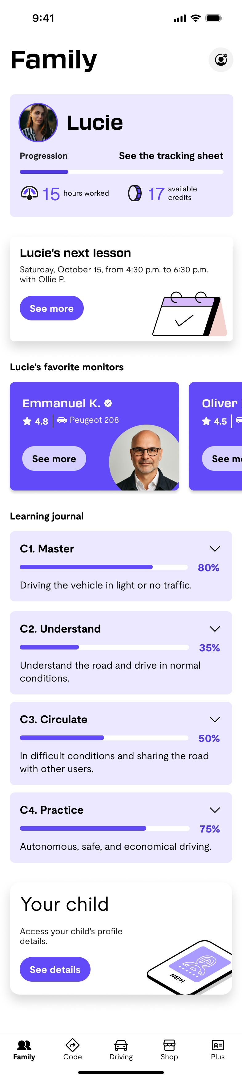

9:41
After
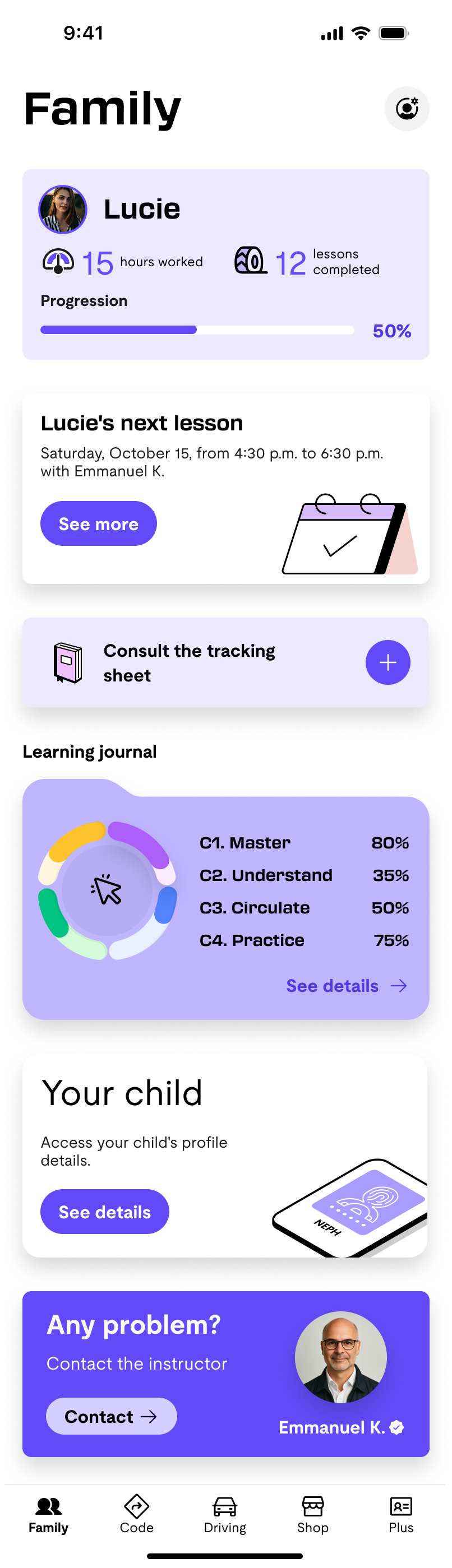

9:41
08 | Design decisions
Our Priorities
Key Learning: The journey from V1 to V4 shows that parents don't want a one-size-fits-all solution. Success came from combining rich pedagogical content with personalization options, allowing each parent to configure their level of involvement while maintaining access to quality insights about their child's learning progress.
Profile Refinement: Based on testing results, we removed the "Complete Autonomy" profile (0/5 parents chose it) and streamlined to two core profiles:
Active support
Quiet support
1
Before
"Crédits" | no user could explain what a credit was or how many you needed
4
Before
A vague reminder button with no context about which date or lesson it referred to
5
Before
Three profiles including one that turned off almost all notifications
3
Before
Ornikar's internal competency labels (C1–C4) shown directly to parents
6
Before
Instructor contact prominent throughout the interface
2
Before
Progress data buried, next lesson not visible without scrolling

The settings screen was our most debated feature internally. Ha My and I wanted to cut it | we felt the two-profile system was already flexible enough and the screen added complexity without enough payoff. Thibault argued strongly for keeping it, believing users would want that granular control. We kept it. In hindsight, this is the kind of decision you can only fully evaluate with longer-term usage data | and it's a good example of how team disagreements don't always get resolved by research alone. Sometimes you ship the tension and learn from it.
What we'd do differently | and what we'd protect
Looking back at this project, we made one assumption that cost us a round of redesign, and one bet that turned out to be exactly right.

We designed for three user types too early. Persona-first thinking locked us into a three-profile structure before we'd done enough research to validate it. Next time: start with behavioural patterns from the interviews, not archetypes from the brief.
We built on Ornikar's existing UI kit | but halfway through the week, they shipped a complete redesign of their entire design system. That meant reconciling our work with a moving target in real time, making decisions about what to absorb and what to hold. It was a reminder that design doesn't happen in a vacuum: external constraints can shift mid-sprint, and the ability to adapt quickly is part of the craft.
The learning diary idea came from a small throwaway comment in Morgane's interview. We almost didn't build it in V1 because it felt complex. The fact that it scored 5/5 in testing reminded us: the things users mention casually are often the things they care about most.
If we returned to this project, we'd explore what happens at the end of the journey | the post-exam moment. Parents we interviewed were often emotionally invested in the outcome but had no touchpoint in the app for it. There's an untouched story there.
Verena G

Next
01 | Opening hook
case study
Every parent we spoke to said roughly the same thing:
I trust my child. I trust the instructor. I just have no idea what's actually happening."
Every parent we spoke to said roughly the same thing: "I trust my child. I trust the instructor. I just have no idea what's actually happening."
That gap | between trusting and knowing | is where ornikar lives. This case study follows how our team designed the parent companion app for Ornikar, France's leading online driving school. Our brief was simple on paper: help parents support their teenager through the licence process. What we discovered was more nuanced. Parents didn't want to surveil. They wanted just enough visibility to stay calm.
Building that balance | without tipping into surveillance | shaped every decision in this project.
Team Thibault Pousset, Ha My Vu, Verena Grotenrath

Scope
Discovery
Delivery
RoleUX designUI designResearch
All team members participated in the entire process:from ideation through user research, design, and testing, to iteration.
02 | Context & opportunity
Why this problem is harder than it looks


The core tension we had to solve
Ornikar had already built a strong product for learners. What existed for parents was almost nothing: no visibility on hours completed, no progress updates, no way to contact the instructor without feeling intrusive. Parents were financing the licence | sometimes the entire thing | and operating in complete darkness.
Ornikar had already built a strong product for learners. What existed for parents was almost nothing: no visibility on hours completed, no progress updates, no way to contact the instructor without feeling intrusive. Parents were financing the licence | sometimes the entire thing | and operating in complete darkness.
The opportunity wasn't just to build a notification system. It was to reframe the parent's role entirely: from anxious bystander to calm, informed supporter. That reframe became our north star.
We interviewed five parents across a range of situations: children who hadn't yet started, children mid-way through, and children nearly ready to sit their exam. We specifically sought variety in involvement style | from hands-off to closely engaged | to avoid designing for a single persona.
Solange
Daughter learning code, very hands-off, age gap means low urgency
Morgane
Child hasn't started yet, strong autonomy values, anxious about choice paralysis
Ségolène
Two children in process, pays for it, wants key info only | not an extra app
Kaelig
Older children who enrolled without telling parents | near-total autonomy
Philippe
Reluctant about the licence, strong education philosophy of self-reliance
We moderated across the team | Thibault, Ha My, and Verena | to prevent a single interviewer's framing from biasing the synthesis.
This mattered: the same question landed differently depending on who asked it.
Information Needs vs Current Satisfaction
Detailed Process Info
Gap 55%
Priority
95%
Current Satisfaction
40%
Regular Progress Updates
Gap 45%
Priority
90%
Current Satisfaction
45%
Instructor Feedback
Gap 50%
Priority
85%
Current Satisfaction
35%
Instructor Feedback
Gap 50%
Priority
85%
Current Satisfaction
35%
Statistics & Comparisons
Gap 50%
Priority
70%
Current Satisfaction
20%
Milestone Notifications
Gap 30%
Priority
80%
Current Satisfaction
50%
What we were really trying to understand
Before touching Figma, our team of three spent a week in qualitative research. We structured our interviews around three questions that we thought would tell us everything | and one of them turned out to be wrong.
We went in expecting to find frustrated parents who wanted more control. What we found were parents who had actively chosen to step back | but were unsettled by the silence that followed. Our original assumption that "more information = better" needed rethinking almost immediately.
Parental Involvement Levels
Financial Support
Progress Monitoring

Administrative Help
Instructor Communication
Emotional Support
Practice Supervision
Primary Parent Concerns
Progress Visibility: 20%
Cost Management: 5%
Communication Gaps: 15%
Instructor Quality: 25%
Safety & Security: 35%
What actually surprised us
No tool, no update, no moment of shared progress. Our job was to create those moments without making the child feel watched.
Parents were universally "in the fog"
Parents were universally "in the fog"
Every interviewee | regardless of how involved they wanted to be | had no idea how many hours their child had completed, what skills were mastered, or when the exam might realistically happen.
Autonomy wasn't avoidance | it was a value
Parents who were hands-off had made a deliberate choice. They trusted their children and the professionals. They didn't want to be pulled in | they wanted reassurance that not intervening was the right call.
Dialogue almost always started with the parent
Across nearly all interviews, it was the parent initiating check-ins, not the child. Yet parents felt awkward about this | like they were intruding on something that belonged to the teenager.
Crises created the most unmet need
Ségolène's daughter had a difficult episode with an instructor. The school handled it, but Ségolène only found out through her daughter | not through Ornikar. That gap between incident and awareness was the sharpest pain point we heard.
Kaelig, parent of two Ornikar learners
Unless you drive with them, you wouldn't know. Titouan - I have no idea.
That quote | "when you're not in the car, you know nothing" | became a design mantra for us. The parent's experience was structurally invisible.
05 | Ideation




Our first bet | and why we had to change it
Our V1 had three parent profiles: Soutien Actif (all notifications on), Soutien Discret (limited alerts), and Autonomie Maximale (fully hands-off). It felt elegant in theory | we were honouring different parenting philosophies.
Testing it revealed a problem we hadn't anticipated.
Parent experience
Limited information | the child drives their own journey independently, with minimal parental visibility.
Parent experience
More visibility on learning | parents can follow progress without interfering with their child's autonomy.
L
M
M
J
V
S
D
30
31
1
2
3
4
5

6
7
8
9
10
11
12
13
14
15
16
17
18
19
20
21
22
23
24
25
26
27
28
29
30
31
1
2
Parent experience
Total visibility on progress | full access to upcoming lessons, hours completed, credits, and favourite instructors.
One size doesn't fit all. Beyond the three pre-defined modes, parents can individually toggle which information they want to see | from progress bars and exam dates to instructor profiles and the learning log.

1
Learning journal
5/5 find it important
It's more fun! You can get information about driving. It does what you would expect from an app.
2
Test 1:
Massive rejection (20% satisfaction)
I don't understand, there's nothing clickable. I need to click everywhere, that's just how I am. I'd like to be able to click on more things.
3
Instructor cards
4/5 don't see the value
Seeing the instructor, yes, but well... maybe some parents are interested in that. I don't see the added value of the instructors.
4
Visual consistency
Persistent issues
The color code is not the same, there is no legend. I don't understand the color code. There is a problem with consistency between the colors.
What we assumed
Parents who were hands-off had made a deliberate choice. They trusted their children and the professionals. They didn't want to be pulled in | they wanted reassurance that not intervening was the right call.
What testing showed
Across nearly all interviews, it was the parent initiating check-ins, not the child. Yet parents felt awkward about this | like they were intruding on something that belonged to the teenager.
A parent on using the learning diary together
On regarde ensemble où elle en est | c'est productif pour elle.
That last finding reframed everything. The learning diary wasn't a feature | it was the feature. Parents didn't want to monitor; they wanted a shared object that could make a conversation happen naturally.
The diary gave them permission to ask without prying.
What testing showed
Before

9:41
After

9:41
08 | Design decisions
Our Priorities
Key Learning: The journey from V1 to V4 shows that parents don't want a one-size-fits-all solution. Success came from combining rich pedagogical content with personalization options, allowing each parent to configure their level of involvement while maintaining access to quality insights about their child's learning progress.
Profile Refinement: Based on testing results, we removed the "Complete Autonomy" profile (0/5 parents chose it) and streamlined to two core profiles:
Active support
Quiet support
1
Before
"Crédits" | no user could explain what a credit was or how many you needed
4
Before
A vague reminder button with no context about which date or lesson it referred to
2
Before
Progress data buried, next lesson not visible without scrolling
5
Before
Three profiles including one that turned off almost all notifications
3
Before
Ornikar's internal competency labels (C1–C4) shown directly to parents
6
Before
Instructor contact prominent throughout the interface

The settings screen was our most debated feature internally. Ha My and I wanted to cut it | we felt the two-profile system was already flexible enough and the screen added complexity without enough payoff. Thibault argued strongly for keeping it, believing users would want that granular control. We kept it. In hindsight, this is the kind of decision you can only fully evaluate with longer-term usage data | and it's a good example of how team disagreements don't always get resolved by research alone. Sometimes you ship the tension and learn from it.
If we returned to this project, we'd explore what happens at the end of the journey | the post-exam moment. Parents we interviewed were often emotionally invested in the outcome but had no touchpoint in the app for it. There's an untouched story there.
We built on Ornikar's existing UI kit | but halfway through the week, they shipped a complete redesign of their entire design system. That meant reconciling our work with a moving target in real time, making decisions about what to absorb and what to hold. It was a reminder that design doesn't happen in a vacuum: external constraints can shift mid-sprint, and the ability to adapt quickly is part of the craft.
What we'd do differently | and what we'd protect
Looking back at this project, we made one assumption that cost us a round of redesign, and one bet that turned out to be exactly right.

We designed for three user types too early. Persona-first thinking locked us into a three-profile structure before we'd done enough research to validate it. Next time: start with behavioural patterns from the interviews, not archetypes from the brief.
The learning diary idea came from a small throwaway comment in Morgane's interview. We almost didn't build it in V1 because it felt complex. The fact that it scored 5/5 in testing reminded us: the things users mention casually are often the things they care about most.
Verena G
Next
01 | Opening hook
case study


Every parent we spoke to said roughly the same thing:
I trust my child. I trust the instructor. I just have no idea what's actually happening."
Every parent we spoke to said roughly the same thing: "I trust my child. I trust the instructor. I just have no idea what's actually happening."
That gap | between trusting and knowing | is where ornikar lives. This case study follows how our team designed the parent companion app for Ornikar, France's leading online driving school. Our brief was simple on paper: help parents support their teenager through the licence process. What we discovered was more nuanced. Parents didn't want to surveil. They wanted just enough visibility to stay calm.
Building that balance | without tipping into surveillance | shaped every decision in this project.
Team Thibault Pousset, Ha My Vu, Verena Grotenrath

Scope
Discovery
Delivery
RoleUX designUI designResearch
All team members participated in the entire process:from ideation through user research, design, and testing, to iteration.
The core tension we had to solve
Ornikar had already built a strong product for learners. What existed for parents was almost nothing: no visibility on hours completed, no progress updates, no way to contact the instructor without feeling intrusive. Parents were financing the licence | sometimes the entire thing | and operating in complete darkness.
The opportunity wasn't just to build a notification system. It was to reframe the parent's role entirely: from anxious bystander to calm, informed supporter. That reframe became our north star.
Ornikar had already built a strong product for learners. What existed for parents was almost nothing: no visibility on hours completed, no progress updates, no way to contact the instructor without feeling intrusive. Parents were financing the licence | sometimes the entire thing | and operating in complete darkness.
02 | Context & opportunity
Why this problem is harder than it looks
What we were really trying to understand
Before touching Figma, our team of three spent a week in qualitative research. We structured our interviews around three questions that we thought would tell us everything | and one of them turned out to be wrong.
We went in expecting to find frustrated parents who wanted more control. What we found were parents who had actively chosen to step back | but were unsettled by the silence that followed. Our original assumption that "more information = better" needed rethinking almost immediately.
We interviewed five parents across a range of situations: children who hadn't yet started, children mid-way through, and children nearly ready to sit their exam. We specifically sought variety in involvement style | from hands-off to closely engaged | to avoid designing for a single persona.
Solange
Daughter learning code, very hands-off, age gap means low urgency
Ségolène
Two children in process, pays for it, wants key info only | not an extra app
Morgane
Child hasn't started yet, strong autonomy values, anxious about choice paralysis
Kaelig
Older children who enrolled without telling parents | near-total autonomy
Philippe
Reluctant about the licence, strong education philosophy of self-reliance
We moderated across the team | Thibault, Ha My, and Verena | to prevent a single interviewer's framing from biasing the synthesis.
This mattered: the same question landed differently depending on who asked it.
Primary Parent Concerns
Progress Visibility: 20%
Communication Gaps: 15%
Cost Management: 5%
Instructor Quality: 25%
Safety & Security: 35%

Parental Involvement Levels
Financial Support
Progress Monitoring

Administrative Help
Instructor Communication
Emotional Support
Practice Supervision
Information Needs vs Current Satisfaction
Detailed Process Info
Gap 55%
Priority
95%
Current Satisfaction
40%
Regular Progress Updates
Gap 45%
Priority
90%
Current Satisfaction
45%
Instructor Feedback
Gap 50%
Priority
85%
Current Satisfaction
35%
Instructor Feedback
Gap 50%
Priority
85%
Current Satisfaction
35%
Statistics & Comparisons
Gap 50%
Priority
70%
Current Satisfaction
20%
Milestone Notifications
Gap 30%
Priority
80%
Current Satisfaction
50%
What actually surprised us
No tool, no update, no moment of shared progress. Our job was to create those moments without making the child feel watched.
Parents were universally "in the fog"
Parents were universally "in the fog"
Every interviewee | regardless of how involved they wanted to be | had no idea how many hours their child had completed, what skills were mastered, or when the exam might realistically happen.
Autonomy wasn't avoidance | it was a value
Parents who were hands-off had made a deliberate choice. They trusted their children and the professionals. They didn't want to be pulled in | they wanted reassurance that not intervening was the right call.
Dialogue almost always started with the parent
Across nearly all interviews, it was the parent initiating check-ins, not the child. Yet parents felt awkward about this | like they were intruding on something that belonged to the teenager.
Crises created the most unmet need
Ségolène's daughter had a difficult episode with an instructor. The school handled it, but Ségolène only found out through her daughter | not through Ornikar. That gap between incident and awareness was the sharpest pain point we heard.
Kaelig, parent of two Ornikar learners
Unless you drive with them, you wouldn't know. Titouan - I have no idea.
That quote | "when you're not in the car, you know nothing" | became a design mantra for us. The parent's experience was structurally invisible.
05 | Ideation







Our first bet | and why we had to change it
Our V1 had three parent profiles: Soutien Actif (all notifications on), Soutien Discret (limited alerts), and Autonomie Maximale (fully hands-off). It felt elegant in theory | we were honouring different parenting philosophies.
Testing it revealed a problem we hadn't anticipated.
Parent experience
Limited information | the child drives their own journey independently, with minimal parental visibility.
Parent experience
More visibility on learning | parents can follow progress without interfering with their child's autonomy.
L
M
M
J
V
S
D
30
31
1
2
3
4
5

6
7
8
9
10
11
12
13
14
15
16
17
18
19
20
21
22
23
24
25
26
27
28
29
30
31
1
2
Parent experience
Total visibility on progress | full access to upcoming lessons, hours completed, credits, and favourite instructors.
One size doesn't fit all. Beyond the three pre-defined modes, parents can individually toggle which information they want to see | from progress bars and exam dates to instructor profiles and the learning log.

1
Learning journal
5/5 find it important
It's more fun! You can get information about driving. It does what you would expect from an app.
2
Test 1:
Massive rejection (20% satisfaction)
I don't understand, there's nothing clickable. I need to click everywhere, that's just how I am. I'd like to be able to click on more things.
3
Instructor cards
4/5 don't see the value
Seeing the instructor, yes, but well... maybe some parents are interested in that. I don't see the added value of the instructors.
4
Visual consistency
Persistent issues
The color code is not the same, there is no legend. I don't understand the color code. There is a problem with consistency between the colors.
What we assumed
Parents who were hands-off had made a deliberate choice. They trusted their children and the professionals. They didn't want to be pulled in | they wanted reassurance that not intervening was the right call.
What testing showed
Across nearly all interviews, it was the parent initiating check-ins, not the child. Yet parents felt awkward about this | like they were intruding on something that belonged to the teenager.
A parent on using the learning diary together
On regarde ensemble où elle en est | c'est productif pour elle.
That last finding reframed everything. The learning diary wasn't a feature | it was the feature. Parents didn't want to monitor; they wanted a shared object that could make a conversation happen naturally.
The diary gave them permission to ask without prying.
What testing showed
Before

9:41
After

9:41
08 | Design decisions
Our Priorities
Key Learning: The journey from V1 to V4 shows that parents don't want a one-size-fits-all solution. Success came from combining rich pedagogical content with personalization options, allowing each parent to configure their level of involvement while maintaining access to quality insights about their child's learning progress.
Profile Refinement: Based on testing results, we removed the "Complete Autonomy" profile (0/5 parents chose it) and streamlined to two core profiles:
Active support
Quiet support
1
Before
"Crédits" | no user could explain what a credit was or how many you needed
4
Before
A vague reminder button with no context about which date or lesson it referred to
2
Before
Progress data buried, next lesson not visible without scrolling
5
Before
Three profiles including one that turned off almost all notifications
3
Before
Ornikar's internal competency labels (C1–C4) shown directly to parents
6
Before
Instructor contact prominent throughout the interface
What we'd do differently | and what we'd protect
We designed for three user types too early. Persona-first thinking locked us into a three-profile structure before we'd done enough research to validate it. Next time: start with behavioural patterns from the interviews, not archetypes from the brief.
The learning diary idea came from a small throwaway comment in Morgane's interview. We almost didn't build it in V1 because it felt complex. The fact that it scored 5/5 in testing reminded us: the things users mention casually are often the things they care about most.
The settings screen was our most debated feature internally. Ha My and I wanted to cut it | we felt the two-profile system was already flexible enough and the screen added complexity without enough payoff. Thibault argued strongly for keeping it, believing users would want that granular control. We kept it. In hindsight, this is the kind of decision you can only fully evaluate with longer-term usage data | and it's a good example of how team disagreements don't always get resolved by research alone. Sometimes you ship the tension and learn from it.
We built on Ornikar's existing UI kit | but halfway through the week, they shipped a complete redesign of their entire design system. That meant reconciling our work with a moving target in real time, making decisions about what to absorb and what to hold. It was a reminder that design doesn't happen in a vacuum: external constraints can shift mid-sprint, and the ability to adapt quickly is part of the craft.
If we returned to this project, we'd explore what happens at the end of the journey | the post-exam moment. Parents we interviewed were often emotionally invested in the outcome but had no touchpoint in the app for it. There's an untouched story there.
Looking back at this project, we made one assumption that cost us a round of redesign, and one bet that turned out to be exactly right.
Verena G
Next
01 | Opening hook
case study

Every parent we spoke to said roughly the same thing:
I trust my child. I trust the instructor. I just have no idea what's actually happening."
That gap | between trusting and knowing | is where ornikar lives. This case study follows how our team designed the parent companion app for Ornikar, France's leading online driving school. Our brief was simple on paper: help parents support their teenager through the licence process. What we discovered was more nuanced. Parents didn't want to surveil. They wanted just enough visibility to stay calm.
Building that balance | without tipping into surveillance | shaped every decision in this project.
Team Thibault Pousset, Ha My Vu, Verena Grotenrath
Scope
Discovery
Delivery
RoleUX designUI designResearch
All team members participated in the entire process:from ideation through user research, design, and testing, to iteration.
02 | Context & opportunity
Why this problem is harder than it looks
Ornikar had already built a strong product for learners. What existed for parents was almost nothing: no visibility on hours completed, no progress updates, no way to contact the instructor without feeling intrusive. Parents were financing the licence | sometimes the entire thing | and operating in complete darkness.
The opportunity wasn't just to build a notification system. It was to reframe the parent's role entirely: from anxious bystander to calm, informed supporter. That reframe became our north star.
The core tension we had to solve
Ornikar had already built a strong product for learners. What existed for parents was almost nothing: no visibility on hours completed, no progress updates, no way to contact the instructor without feeling intrusive. Parents were financing the licence | sometimes the entire thing | and operating in complete darkness.
Before touching Figma, our team of three spent a week in qualitative research. We structured our interviews around three questions that we thought would tell us everything | and one of them turned out to be wrong.
We went in expecting to find frustrated parents who wanted more control. What we found were parents who had actively chosen to step back | but were unsettled by the silence that followed. Our original assumption that "more information = better" needed rethinking almost immediately.
We interviewed five parents across a range of situations: children who hadn't yet started, children mid-way through, and children nearly ready to sit their exam. We specifically sought variety in involvement style | from hands-off to closely engaged | to avoid designing for a single persona.
Solange
Daughter learning code, very hands-off, age gap means low urgency
Morgane
Child hasn't started yet, strong autonomy values, anxious about choice paralysis
Ségolène
Two children in process, pays for it, wants key info only | not an extra app
Kaelig
Older children who enrolled without telling parents | near-total autonomy
Philippe
Reluctant about the licence, strong education philosophy of self-reliance
We moderated across the team | Thibault, Ha My, and Verena | to prevent a single interviewer's framing from biasing the synthesis.
This mattered: the same question landed differently depending on who asked it.
Primary Parent Concerns
Safety & Security: 35%
Progress Visibility: 20%
Cost Management: 5%
Communication Gaps: 15%
Instructor Quality: 25%

Parental Involvement Levels
Financial Support
Progress Monitoring
Administrative Help
Instructor Communication
Emotional Support
Practice Supervision
Information Needs vs Current Satisfaction
Detailed Process Info
Gap 55%
Priority
95%
Current Satisfaction
40%
Regular Progress Updates
Gap 45%
Priority
90%
Current Satisfaction
45%
Instructor Feedback
Gap 50%
Priority
85%
Current Satisfaction
35%
Instructor Feedback
Gap 50%
Priority
85%
Current Satisfaction
35%
Statistics & Comparisons
Gap 50%
Priority
70%
Current Satisfaction
20%
Milestone Notifications
Gap 30%
Priority
80%
Current Satisfaction
50%
What we were really trying to understand
What actually surprised us
Parents were universally "in the fog"
Every interviewee | regardless of how involved they wanted to be | had no idea how many hours their child had completed, what skills were mastered, or when the exam might realistically happen.
Autonomy wasn't avoidance | it was a value
Parents who were hands-off had made a deliberate choice. They trusted their children and the professionals. They didn't want to be pulled in | they wanted reassurance that not intervening was the right call.
Dialogue almost always started with the parent
Across nearly all interviews, it was the parent initiating check-ins, not the child. Yet parents felt awkward about this | like they were intruding on something that belonged to the teenager.
Crises created the most unmet need
Ségolène's daughter had a difficult episode with an instructor. The school handled it, but Ségolène only found out through her daughter | not through Ornikar. That gap between incident and awareness was the sharpest pain point we heard.
Unless you drive with them, you wouldn't know. Titouan - I have no idea.
Kaelig, parent of two Ornikar learners
That quote | "when you're not in the car, you know nothing" | became a design mantra for us. The parent's experience was structurally invisible.
No tool, no update, no moment of shared progress. Our job was to create those moments without making the child feel watched.
05 | Ideation


Our first bet | and why we had to change it
Our V1 had three parent profiles: Soutien Actif (all notifications on), Soutien Discret (limited alerts), and Autonomie Maximale (fully hands-off). It felt elegant in theory | we were honouring different parenting philosophies.
Testing it revealed a problem we hadn't anticipated.
Parent experience
Limited information | the child drives their own journey independently, with minimal parental visibility.
Parent experience
More visibility on learning | parents can follow progress without interfering with their child's autonomy.
L
M
M
J
V
S
D
30
31
1
2
3
4
5
6
7
8
9
10
11
12
13
14
15
16
17
18
19
20
21
22
23
24
25
26
27
28
29
30
31
1
2
Parent experience
Total visibility on progress | full access to upcoming lessons, hours completed, credits, and favourite instructors.
One size doesn't fit all. Beyond the three pre-defined modes, parents can individually toggle which information they want to see | from progress bars and exam dates to instructor profiles and the learning log.

1
Learning journal
5/5 find it important
It's more fun! You can get information about driving. It does what you would expect from an app.
2
Test 1:
Massive rejection (20% satisfaction)
I don't understand, there's nothing clickable. I need to click everywhere, that's just how I am. I'd like to be able to click on more things.
3
Instructor cards
4/5 don't see the value
Seeing the instructor, yes, but well... maybe some parents are interested in that. I don't see the added value of the instructors.
4
Visual consistency
Persistent issues
The color code is not the same, there is no legend. I don't understand the color code. There is a problem with consistency between the colors.
What we assumed
Three distinct parent archetypes with stable preferences
Parents who want zero involvement will choose "Autonomie Maximale"
"Crédits" was clear enough as a progress unit
The learning diary (carnet) was a nice-to-have. Parents who were hands-off had made a deliberate choice. They trusted their children and the professionals. They didn't want to be pulled in | they wanted reassurance that not intervening was the right call.
What testing showed
Across nearly all interviews, it was the parent initiating check-ins, not the child. Yet parents felt awkward about this | like they were intruding on something that belonged to the teenager.
On regarde ensemble où elle en est | c'est productif pour elle.
A parent on using the learning diary together
That last finding reframed everything. The learning diary wasn't a feature | it was the feature. Parents didn't want to monitor; they wanted a shared object that could make a conversation happen naturally.
The diary gave them permission to ask without prying.
What testing showed
Before
9:41
After
9:41
08 | Design decisions
Six changes | and the why behind each oneOur Priorities
Key Learning: The journey from V1 to V4 shows that parents don't want a one-size-fits-all solution. Success came from combining rich pedagogical content with personalization options, allowing each parent to configure their level of involvement while maintaining access to quality insights about their child's learning progress.
Profile Refinement: Based on testing results, we removed the "Complete Autonomy" profile (0/5 parents chose it) and streamlined to two core profiles:
Active support
Quiet support
1
Before
"Crédits" | no user could explain what a credit was or how many you needed
4
Before
A vague reminder button with no context about which date or lesson it referred to
2
Before
Progress data buried, next lesson not visible without scrolling
5
Before
Three profiles including one that turned off almost all notifications
3
Before
Ornikar's internal competency labels (C1–C4) shown directly to parents
6
Before
Instructor contact prominent throughout the interface
Looking back at this project, we made one assumption that cost us a round of redesign, and one bet that turned out to be exactly right.
What we'd do differently | and what we'd protect

We designed for three user types too early. Persona-first thinking locked us into a three-profile structure before we'd done enough research to validate it. Next time: start with behavioural patterns from the interviews, not archetypes from the brief.
We built on Ornikar's existing UI kit | but halfway through the week, they shipped a complete redesign of their entire design system. That meant reconciling our work with a moving target in real time, making decisions about what to absorb and what to hold. It was a reminder that design doesn't happen in a vacuum: external constraints can shift mid-sprint, and the ability to adapt quickly is part of the craft.
The learning diary idea came from a small throwaway comment in Morgane's interview. We almost didn't build it in V1 because it felt complex. The fact that it scored 5/5 in testing reminded us: the things users mention casually are often the things they care about most.
The settings screen was our most debated feature internally. Ha My and I wanted to cut it | we felt the two-profile system was already flexible enough and the screen added complexity without enough payoff. Thibault argued strongly for keeping it, believing users would want that granular control. We kept it. In hindsight, this is the kind of decision you can only fully evaluate with longer-term usage data | and it's a good example of how team disagreements don't always get resolved by research alone. Sometimes you ship the tension and learn from it.
If we returned to this project, we'd explore what happens at the end of the journey | the post-exam moment. Parents we interviewed were often emotionally invested in the outcome but had no touchpoint in the app for it. There's an untouched story there.
Verena G
Context & opportunity
Research objectives
Key insights
ideation
First version
Key learnings
Design decisions
Next
01 | Opening hook
case study
Every parent we spoke to said roughly the same thing:
I trust my child. I trust the instructor. I just have no idea what's actually happening."
That gap | between trusting and knowing | is where ornikar lives. This case study follows how our team designed the parent companion app for Ornikar, France's leading online driving school. Our brief was simple on paper: help parents support their teenager through the licence process. What we discovered was more nuanced. Parents didn't want to surveil. They wanted just enough visibility to stay calm.
Building that balance | without tipping into surveillance | shaped every decision in this project.
Team Thibault Pousset, Ha My Vu, Verena Grotenrath
Scope
Discovery
Delivery
RoleUX designUI designResearch
All team members participated in the entire process:from ideation through user research, design, and testing, to iteration.
02 | Context & opportunity
Why this problem is harder than it looks
Ornikar had already built a strong product for learners. What existed for parents was almost nothing: no visibility on hours completed, no progress updates, no way to contact the instructor without feeling intrusive. Parents were financing the licence | sometimes the entire thing | and operating in complete darkness.
The opportunity wasn't just to build a notification system. It was to reframe the parent's role entirely: from anxious bystander to calm, informed supporter. That reframe became our north star.
The core tension we had to solve
Ornikar had already built a strong product for learners. What existed for parents was almost nothing: no visibility on hours completed, no progress updates, no way to contact the instructor without feeling intrusive. Parents were financing the licence | sometimes the entire thing | and operating in complete darkness.
Solange
Daughter learning code, very hands-off, age gap means low urgency
Morgane
Child hasn't started yet, strong autonomy values, anxious about choice paralysis
Ségolène
Two children in process, pays for it, wants key info only | not an extra app
Kaelig
Older children who enrolled without telling parents | near-total autonomy
Philippe
Reluctant about the licence, strong education philosophy of self-reliance
We moderated across the team | Thibault, Ha My, and Verena | to prevent a single interviewer's framing from biasing the synthesis.
This mattered: the same question landed differently depending on who asked it.
Information Needs vs Current Satisfaction
Detailed Process Info
Gap 55%
Priority
95%
Current Satisfaction
40%
Regular Progress Updates
Gap 45%
Priority
90%
Current Satisfaction
45%
Instructor Feedback
Gap 50%
Priority
85%
Current Satisfaction
35%
Instructor Feedback
Gap 50%
Priority
85%
Current Satisfaction
35%
Statistics & Comparisons
Gap 50%
Priority
70%
Current Satisfaction
20%
Milestone Notifications
Gap 30%
Priority
80%
Current Satisfaction
50%
Parental Involvement Levels
Financial Support
Progress Monitoring
Administrative Help
Instructor Communication
Emotional Support
Practice Supervision
Primary Parent Concerns
Progress Visibility: 20%
Cost Management: 5%
Communication Gaps: 15%
Instructor Quality: 25%
Safety & Security: 35%

Before touching Figma, our team of three spent a week in qualitative research. We structured our interviews around three questions that we thought would tell us everything | and one of them turned out to be wrong.
We went in expecting to find frustrated parents who wanted more control. What we found were parents who had actively chosen to step back | but were unsettled by the silence that followed. Our original assumption that "more information = better" needed rethinking almost immediately.
We interviewed five parents across a range of situations: children who hadn't yet started, children mid-way through, and children nearly ready to sit their exam. We specifically sought variety in involvement style | from hands-off to closely engaged | to avoid designing for a single persona.
What we were really trying to understand
What actually surprised us
No tool, no update, no moment of shared progress. Our job was to create those moments without making the child feel watched.
Parents were universally "in the fog"
Every interviewee | regardless of how involved they wanted to be | had no idea how many hours their child had completed, what skills were mastered, or when the exam might realistically happen.
Autonomy wasn't avoidance | it was a value
Parents who were hands-off had made a deliberate choice. They trusted their children and the professionals. They didn't want to be pulled in | they wanted reassurance that not intervening was the right call.
Dialogue almost always started with the parent
Across nearly all interviews, it was the parent initiating check-ins, not the child. Yet parents felt awkward about this | like they were intruding on something that belonged to the teenager.
Crises created the most unmet need
Ségolène's daughter had a difficult episode with an instructor. The school handled it, but Ségolène only found out through her daughter | not through Ornikar. That gap between incident and awareness was the sharpest pain point we heard.
Unless you drive with them, you wouldn't know. Titouan - I have no idea.
Kaelig, parent of two Ornikar learners
That quote | "when you're not in the car, you know nothing" | became a design mantra for us. The parent's experience was structurally invisible.
05 | Ideation


Our first bet | and why we had to change it
Our V1 had three parent profiles: Soutien Actif (all notifications on), Soutien Discret (limited alerts), and Autonomie Maximale (fully hands-off). It felt elegant in theory | we were honouring different parenting philosophies.
Testing it revealed a problem we hadn't anticipated.
Parent experience
Limited information | the child drives their own journey independently, with minimal parental visibility.
Parent experience
More visibility on learning | parents can follow progress without interfering with their child's autonomy.
L
M
M
J
V
S
D
30
31
1
2
3
4
5
6
7
8
9
10
11
12
13
14
15
16
17
18
19
20
21
22
23
24
25
26
27
28
29
30
31
1
2
Parent experience
Total visibility on progress | full access to upcoming lessons, hours completed, credits, and favourite instructors.
One size doesn't fit all. Beyond the three pre-defined modes, parents can individually toggle which information they want to see | from progress bars and exam dates to instructor profiles and the learning log.
What testing showed
We take a look together at where she stands - it's helpful for her.
A parent on using the learning diary together
1
Learning journal
5/5 find it important
It's more fun! You can get information about driving. It does what you would expect from an app.
2
Test 1:
Massive rejection (20% satisfaction)
I don't understand, there's nothing clickable. I need to click everywhere, that's just how I am. I'd like to be able to click on more things.
3
Instructor cards
4/5 don't see the value
Seeing the instructor, yes, but well... maybe some parents are interested in that. I don't see the added value of the instructors.
4
Visual consistency
Persistent issues
The color code is not the same, there is no legend. I don't understand the color code. There is a problem with consistency between the colors.
What we assumed
Three distinct parent archetypes with stable preferences
Parents who want zero involvement will choose "Autonomie Maximale"
"Crédits" was clear enough as a progress unit
The learning diary (carnet) was a nice-to-have. Parents who were hands-off had made a deliberate choice. They trusted their children and the professionals. They didn't want to be pulled in | they wanted reassurance that not intervening was the right call.
What testing showed
Across nearly all interviews, it was the parent initiating check-ins, not the child. Yet parents felt awkward about this | like they were intruding on something that belonged to the teenager.
That last finding reframed everything. The learning diary wasn't a feature | it was the feature. Parents didn't want to monitor; they wanted a shared object that could make a conversation happen naturally.
The diary gave them permission to ask without prying.
Before
9:41
After
9:41
08 | Design decisions
Six changes | and the why behind each oneOur Priorities
Key Learning: The journey from V1 to V4 shows that parents don't want a one-size-fits-all solution. Success came from combining rich pedagogical content with personalization options, allowing each parent to configure their level of involvement while maintaining access to quality insights about their child's learning progress.
Profile Refinement: Based on testing results, we removed the "Complete Autonomy" profile (0/5 parents chose it) and streamlined to two core profiles:
Active support
Quiet support
1
Before
"Crédits" | no user could explain what a credit was or how many you needed
4
Before
A vague reminder button with no context about which date or lesson it referred to
2
Before
Progress data buried, next lesson not visible without scrolling
5
Before
Three profiles including one that turned off almost all notifications
3
Before
Ornikar's internal competency labels (C1–C4) shown directly to parents
6
Before
Instructor contact prominent throughout the interface
We designed for three user types too early. Persona-first thinking locked us into a three-profile structure before we'd done enough research to validate it. Next time: start with behavioural patterns from the interviews, not archetypes from the brief.
The learning diary idea came from a small throwaway comment in Morgane's interview. We almost didn't build it in V1 because it felt complex. The fact that it scored 5/5 in testing reminded us: the things users mention casually are often the things they care about most.
Looking back at this project, we made one assumption that cost us a round of redesign, and one bet that turned out to be exactly right.
If we returned to this project, we'd explore what happens at the end of the journey | the post-exam moment. Parents we interviewed were often emotionally invested in the outcome but had no touchpoint in the app for it. There's an untouched story there.
What we'd do differently | and what we'd protect
We built on Ornikar's existing UI kit | but halfway through the week, they shipped a complete redesign of their entire design system. That meant reconciling our work with a moving target in real time, making decisions about what to absorb and what to hold. It was a reminder that design doesn't happen in a vacuum: external constraints can shift mid-sprint, and the ability to adapt quickly is part of the craft.
The settings screen was our most debated feature internally. Ha My and I wanted to cut it | we felt the two-profile system was already flexible enough and the screen added complexity without enough payoff. Thibault argued strongly for keeping it, believing users would want that granular control. We kept it. In hindsight, this is the kind of decision you can only fully evaluate with longer-term usage data | and it's a good example of how team disagreements don't always get resolved by research alone. Sometimes you ship the tension and learn from it.
Verena G
Context & opportunity
Research objectives
Key insights
ideation
First version
Key learnings
Design decisions
Next